The Artist as a Young Mutant

The Artist as a Young Mutant
Portrait of the Artist as a Young Mutant
Showing posts with label lettering. Show all posts

Wednesday, July 29, 2015

The Maim of the Game

Some of you may remember CRACKED, prior to its current incarnation as a text/video-oriented humor website, back when it was MAD's main rival in the cartoon humor magazine racket. Working as a freelancer, I was a regular CRACKED contributor for over a decade, starting in late 1989.

Here's what I think was one of my better pieces from my early days there, art from the first of a two-page feature called "TV Gameshows Through History", written by Rob Weske, and published in the pages of CRACKED back in 1992. All the art and lettering are mine, done with Higgins waterproof black ink in dip pen and brush, plus some fine-point Rapidograph pen. 


Like the "mutant artist" banner art at the top of this blog (itself originally done for CRACKED), this was done on Duo Shade board, which was a special, chemically-treated paper that had 'invisible' diagonal hatching and crosshatching lines printed on it, that could be brought out by using two separate chemical solutions with a brush or pen. So, basically, you could draw or paint in a couple of values of grey tone in a black and white illustration, which would show up nicely in reproduction/printing. With the advent of Photoshop tools and high-res computer printers, Duo Shade eventually became both prohibitively expensive and, ultimately, obsolete... but it was an interesting medium to use, at the time.


Here are some detail shots--


I liked to put in old pop culture reference gags, wherever they might fit... so in the arena above, around Kirk Douglas, you can find forgotten 1950s Terrytoons character, "Flebus"; Super Chicken's crime-fighting partner, "Fred"; the lion logo from Random House's old "Step-Up Books" line and, hidden somewhere, the Little Caesar's "Pizza! Pizza!" guy.

Sunday, May 10, 2015

Renovating the Castle

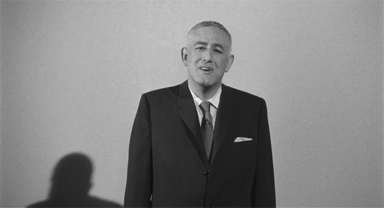
When I wanted to use this 2004 pen & ink/brush drawing I made of director William Castle (from the intro to The Tingler (1959)) to help kick off my "Smoking Holes..." blog earlier this week, I took another look at a screen shot from the film, and noticed that I'd originally gotten a few details of his face and head slightly wrong.

Overall, it looks like him, but just a bit "off"... so I got out my Ugee pad and stylus, and digitally re-drew his brows, nose and chin... touched-up his hair, mouth and ears... and corrected an odd taper I gave his skull just above his ears. I also fixed the weird angular shoulders I had previously given him, and improved the neck shadow. Finally, I made the three separate dialogue balloons into one contiguous balloon, and added a light grey tone to the background, to make him pop out more.


I've Got You Covered!

A handy bit of lettering and cover art for Cartoon Loonacy, a cartoonist's APA which I belong to, which currently boasts such amazing talents as Hilary Barta, Jim Siergey, Brian Buniak, Gary Fields, George Erling, Russ Maheras, Bob Vojtko, Darren Auck, Michael Kraiger, Delaine Derry Green, Yul Tolbert, Mark Campos and Tom DeSieno.

For this piece, a spoofy homage to the old Famous Monsters of Filmland magazine, I inked with a typical combination of watercolor brush, dip pen, and some rapidograph on 2-ply cold finish Bristol board. The rest of the lettering and the color were done on the computer, using Photoshop.